3.2. Basic Line Plots
MathWorks has prepared a lot of documentation and videos on plotting, so some links to their documentation follows.
Here is an introductory video demonstrating line plotting.
Documentation on 2-D Graph and customize lines.
Documentation on 2-D and 3-D plots.
Documentation on the linespec portion of a plot command.
MathWork’s MATLAB Fundamentals course [FUNDAMENTALS] has a good introduction to creating plots.
3.2.1. Basic Plotting Notes
The Plot Tool is easy to use; however, using commands and functions
allows for easier reproduction of plots and more automation. Use the
plot(x, y) function to plot vector y against vector x. If
only a single vector is passed to plot, then the index values of the
vector are used for the \(x\) axis.
Use an additional argument to the plot function to change the color
of the data curve. The following command makes a magenta plot of the
\((x, y)\) values in row vectors x and y.
>> plot(x, y, 'm')
The color codes are:
|
|
|
Use line style codes if you want something other than a solid line. The
following command will plot y versus x with a dotted line.
>> plot(x, y, ':')
The line style codes are:
|
|
You can combine these codes. Generally, the order does not matter, so both of the following commands make a plot using a red dotted line.
>> plot(x, y, 'r:')
>> plot(x, y, ':r')
In addition to color and line style, you can specify a marker style. The
following command will plot y versus x using asterisks.
>> plot(x, y, '*')
Some of the marker style codes are:
|
|
|
If the only plot specification is a marker, the default line style is
none. Add a line style, such as a dash (-), to the marker style to
also plot a line.
The grid command adds or removes a grid to your plot:
>> grid on

>> grid off
3.2.2. Annotating Plots
Labels are added to plots using plot annotation functions such as
xlabel, ylabel, and title. The input to these functions must
be text. Traditionally, the textual data was entered as a character
array made with characters and digits inside a pair of
’apostrophes’ (single quotation marks). MATLAB now allows text
labels that are the newer string arrays made with characters and
digits inside a pair of "quotation marks". The text may be a simple
textual constant or be held in a variable. See Text Strings in MATLAB for more
information on textual data.
>> xlabel('Text Label for X Axis') % a text constant

>> ylabel(yAxisName)               % a text variable
If you need more than one line in an axis label or title, use a cell
array created with a pair of curly brackets {}.
>> title({'first line', 'second line'})
LaTeX markup formatting may be used in the annotations. Thus, x^2
will become \(x^2\) and x_2 becomes \(x_2\). Latex markup is
a default standard for mathematical equations. You can search the
Internet for good documentation on formatting Latex math equations.
Other symbols, such as Greek letters, can also be added, such as
\(\Delta\), \(\gamma\), and \(\pi\). See MathWorks
documentation on Greek Letters and Special
Characters [Greek]. Try the following code to see
what happens.
>> xlabel('\sigma \approx e^{\pi/2}')
If you need to use a symbol such as an underscore (_) or a backslash
(\), then preface it with the escape character \. Thus, to
display \, you must type \\.
The MATLAB text function adds a text annotation to a specified
position on the plot. See the MATLAB documentation for text.
>> text(3, 5, 'Best result')
3.2.3. Starting a New Plot
You may notice your plot being replaced when you enter a new plot
command after making a previous plot. Use the figure command to keep
the previous plot and start over in a new window.
3.2.4. Multiple Plots in the Same Figure
Several small plots may be put in a figure. The subplot(m, n, p)
function accomplishes this by making a grid of \(m{\times}n\) plots.
The variable p is the plot number from 1 to \(m{\times}n\). The
plot for the following code is shown in figure Fig. 3.5.
>> x = linspace(-5, 5);
>> subplot(2, 2, 1), plot(x, x), title('y = x')
>> subplot(2, 2, 2), plot(x, x.^2), title('y = x^2')
>> subplot(2, 2, 3), plot(x, x.^3), title('y = x^3')
>> subplot(2, 2, 4), plot(x, x.^4), title('y = x^4')
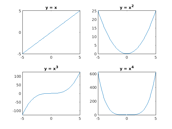
Fig. 3.5 Plots created using subplots
Enhanced subplots with the tiledlayout function were introduced in
MATLAB release R2019b. As with subplot, creating a fixed layout grid
of tiled plots is simple.
>> tiledlayout(2, 2);
The nexttile command is used to advance to the next plot. Several
new features were added beyond the capabilities of subplots.
Figures may now have a global
title,xlabel, andylabelfor the set of plots.The size and spacing between tiles are adjustable. The following commands reduce the spacing between tiles and the padding between the figure’s edges and the tiles’ grid. The net effect is to increase the size of the individual plots.
t = tiledlayout(3, 3);
t.TileSpacing = 'compact';
t.Padding = 'compact';
Specifying the size and location of tiles creates a custom layout by passing a tile number and an optional range of tiles to the
nexttilecommand. The example in figure Fig. 3.6 shows a \(3{\times}3\) grid of tiles. Three plots are added across the first row. Starting at tile 4, the second row is filled with the next plot, spanning a \(1{\times}3\) set of tiles. The third row has a single tile plot and a \(1{\times}2\) tile plot.>> x = linspace(-2,2); >> tiledlayout(3,3) >> nexttile, plot(x,x) >> nexttile, plot(x,x) >> nexttile, plot(x,x) >> nexttile(4, [1 3]) >> plot(x,x) >> nexttile(7), plot(x,x) >> nexttile(8, [1 2]) >> plot(x,x)

Fig. 3.6 Tiled plots with a custom layout
The
’flow’option totiledlayoutadjusts the layout of the plots with eachnexttilecommand. The first plot fills the whole figure. After the second plot, two stacked plots are shown. As each tile is added, the layout of tiles is adjusted to accommodate the new tile, which can show successive changes to data. Run the code from thesawTooth.mfile to see this. Successive plots show the Fourier series of a sawtooth wave as each new sine wave is added. The user presses theEnterkey when they are ready to see the next plot. The final tiled figure with six plots is shown in figure Fig. 3.7.
% File: sawTooth.m
% Plots of the Fourier series of a sawtooth function
% displayed using a tiledlayout. Each time through
% the loop, a new plot is added.

clear; close all
L = 5;
N = 200;
t = linspace(0, 2*L, N);
s = zeros(1, N);
figure
plt = tiledlayout('flow');
title(plt, 'Sawtooth Fourier Series')
for n = 1:6
    nexttile
    s = s + sin(2*pi*n*t/L)/n;
    f = 0.5 - s/pi;
    plot(t, f, 'k', 'LineWidth', 2)
    title(['n = ', num2str(n)])
    if n < 6
        disp('Press enter for next plot')
        pause
    end
end
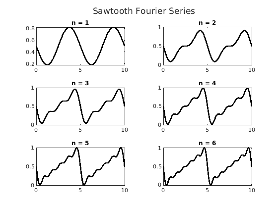
Fig. 3.7 Final sawtooth plots with six tiles
3.2.5. Multiple Plots on the Same Axis
Visualizations are often more informative when multiple data sets are
plotted on the same axes. To add new plots onto an existing axis without
replacing the previous plot, use the hold on command. When you are
done adding plots, issue the hold off command. Then, unless a new
figure is started, the next plotting command issued will replace what is
currently in the figure.
Another way to plot multiple data sets onto a single figure is to put the \(y\) values in a matrix. Each column of the matrix will be a different plot. The following simple examples illustrate both methods. See figure Fig. 3.8 for the plot.
>> % Plot curves from the columns of Y
>> x = linspace(0,10); Y = zeros(100,3);
>> Y(:,1) = x; Y(:,2) = 2*x; Y(:,3) = 3*x;
>> plot(x, Y)
>> % Multiple curve plots on same axes
>> y1 = x; y2 = 2*x; y3 = 3*x;
>> hold on
>> plot(x, y1, 'k'), plot(x, y2, 'k:'), plot(x, y3, 'k-.')
>> hold off
>> xlabel('x'), ylabel('y')
>> legend('y = x', 'y = 2x', 'y = 3 x', 'Location', 'northwest')
>> title('Multi-line Plot')
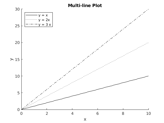
Fig. 3.8 Figure with multiple plots
3.2.6. Adding a Plot Legend
A legend helps identify what data each plot in the graph corresponds to.
The order of legend labels matters—the inputs to legend should be in
the same order in which the plots were drawn.
legend('first label', 'second label')
The legend function also accepts two optional arguments: the keyword
’Location’ and a text description of the location that is given by a
compass direction, such as ’north’ (top center) or ’southwest’
(lower left). The default location for the legend is ’northeast’
(top right).
legend('Trucks', 'Cars', 'Location', 'west')
3.2.7. 2-D Plot Types
MATLAB supports several types of two-dimensional plots. Six types of plots other than basic line plots are described below. Example code to make these plots is also listed below, and figure Fig. 3.9 shows what the plots look like.
- Scatter Plot
scatter(x, y): Scatter plot with variable marker size and color. Example shown in figure Fig. 3.9 (a).
- Bar graph
bar(x, y): Bar graph (vertical and horizontal). Example shown in figure Fig. 3.9 (b).
- Stem plot
stem(x, y): A discrete sequence plot—each point is plotted with a marker and a vertical line to the \(x\) axis. Example shown in figure Fig. 3.9 (c).
- Stair step plot
stairs(x, y): The lines on the plot are either horizontal or vertical, resembling the run and rise of stairs. Example shown in figure Fig. 3.9 (d).
- Pie chart
pie([0.4 0.3 0.2 0.1], labels): The values of the data are passed as a vector that often sums to 1; otherwise, MATLAB will calculate the percentages. The labels of the pie slices should be in a cell array. Example shown in figure Fig. 3.9 (e).
- Filled area plot
area(x,[y1; y2]’): Plot multiple data sets with the area between the \(x\) axis and each data curve shaded a different color. Each data set is in a matrix column passed as the \(y\) data. Example shown in figure Fig. 3.9 (f). Note that if the \(y\) data is in row vectors, then a transpose may be needed to put the data in the columns of the \(Y\) matrix.
% File: Plots2D.m
% Some 2-D plotting examples

x = linspace(0, 2, 10);
y = 5 + x.^2;
y2 = 5 + x;
plts = tiledlayout(3, 3);
plts.TileSpacing = 'compact';
plts.Padding = 'compact';
title(plts, '2-D Plots');
nexttile, scatter(x, y, 'ko'), title('(a) Scatter Plot');
nexttile, bar(x, y, 'k'), title('(b) Bar Chart');
nexttile, stem(x, y, 'k'), title('(c) Stem Plot');
nexttile, stairs(x, y, 'k'), title('(d) Stairs Plot');
labels = {'excellent', 'good', 'fair', 'poor'};
nexttile(5, [2 2]), pie([0.4 0.3 0.2 0.1], labels)
title('(e) Pie Chart')
newcolors = [0.7 0.7 0.7; 0.2 0.2 0.2]; % make grayscale
nexttile(7), area(x, [y2; y]'), title('(f) Area Plot');
colororder(newcolors)
Fig. 3.9 Common types of 2-D plots other than line plots
3.2.8. Axis Control
The axis command returns a 4-element row vector containing the
\(x\) and \(y\) axis limits.
>> v = axis
v =
    10 20 1 5
Use the xlim and ylim functions to set the \(x\) and
\(y\) axis limits. Both functions take a vector of two elements as
input. For example, the following command sets the \(y\) axis range
between 2 and 4.
>> ylim([2 4])
Use the axis tight command to change the limits based on the range
of the data.
We would like the \(x\), \(y\), and \(z\) axes to have the
same scale for plots depicting geometry. There are two ways to
accomplish this. The axis command has an equal option that sets
the scale of each axis to be the same. We can also set the aspect ratio
to be the same for each axis with the daspect function, which takes
a vector with three values, even for 2-D plots.
>> axis equal        % Set the axes scales to be the same
>> %                 % or
>> daspect([1 1 1])  % Another way to accomplish the same
3.2.9. Tick Marks and Labels
MATLAB usually does a good job setting the tick marks on a plot. The tick labels are, by default, the numeric values of the tick marks. We sometimes want to change the labels and locations of the tick marks because specific points on the axis have significance. A good example of this is when plotting equations that use trigonometric functions.
The xticks and yticks functions take vectors of numeric
locations for the tick marks. The xticklabels and yticklabels
functions take cell arrays of textual data. See Text Strings in MATLAB for
more information on cell arrays. The following code illustrates custom
tick marks and labels on the \(x\) axis. Notice also that the title
uses the texlabel function to format strings with LaTeX to match an
equation. The plot is shown in figure Fig. 3.10.
x = linspace(pi/4, 5*pi/4);
figure, plot(x, 4 - 4*sin(2*x - pi/2))
txt = texlabel('f(x) = 4 - 4*sin(2*x - pi/2)');
title(txt), ylabel('f(x)'), xlabel('x')
xticks(linspace(pi/4, 5*pi/4, 5))
xticklabels({'\pi/4', '\pi/2', '3\pi/4','\pi', '5\pi/4'});
axis tight
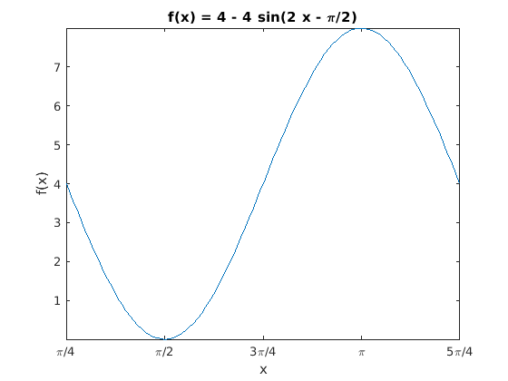
Fig. 3.10 Sine wave with TeX formated \(x\)–axis tick marks and title.